A guide to find all your advertisment design needs. Wheather it may be print media or Web design here is a smart solution to it.
Search
Advertising Tips
Newspaper Advertising
Advertising Career
Tips for News Paper Advertisement Design
Our goal is not to make you into a designer, but to empower you to know when your designer is doing a good job. Here are some general design ideas for newspaper advertising.
- Your newspaper advertising has a zero percent chance of succeeding if your prospect doesn't notice it. Attention is everything in newspaper advertising. You need visual impact [photos], white space, a distinctive border, font, angles, or whatever it takes to stand out on the page. You newspaper advertising must be distinctive, unusual, and it should contrast with the other ads on the page. Be different.
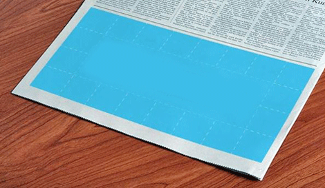
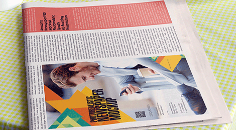
- Paste your ad into the newspaper to get an idea of whether or not it will stand out.
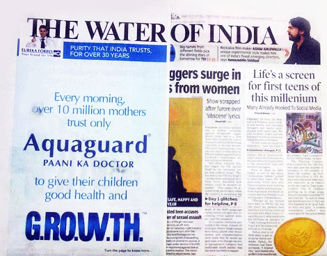
- Where your ad is placed absolutely matters. If your quarter-page ad falls against the fold of the paper, your readership will be cut by half. Poor placement just cost you one half of your customers. Buy a different shape ad that will guarantee you an outside placement.
- What is the paper offering? Run of press [ROP] positioning means that the publisher is free to place your ad anywhere in the normal pages of the paper.
- Use only serif typeface for copy. It boosts reading speed, and can increase comprehension by up to 300% over other fonts.
- Editorial style advertising increases readership by over 50%. With editorial style advertising, the copy is laid out like a regular news story. The word "advertisement" always appears above the copy. If you have a story to tell, think about using editorial style advertising.
- Your newspaper advertising should be easy to look at and easy to read. Poor use of capitalization, bolding, or italics will decrease reading comprehension by 50%. Bad sentence structure will also reduce comprehension.
- Use #12 font for copy. Use #14 font if your customers are senior citizens.
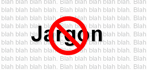
- Don't use technical jargon. You will lose way too many readers.
- Reversed copy gets attention in newspaper advertising, but it is hard to read. If you use it, keep the copy very short, and the font very big.
- Make sure photos face into your ad, not toward a competitors ad.
- Make sure your newspaper advertising looks different from your competitor's. Don't advertise for them.
- Vary sentence and paragraph length. Eight words per sentence will get the highest readership.
- A smaller ad should have a single focus - one solution for one problem.
- Busy layouts often work better than clean, balanced ads because they keep the reader involved.
- Use benefit captions under your photos in all of your newspaper advertising. These will get read.
- Word your offer carefully and clearly. Your offer is a promise about the level of service you will deliver to your customer's. Your offer will set your customers expectations, so you want to be very clear.
- Coupons get the highest response rate for all printed marketing materials. Use one if you can in your newspaper advertising.
With a preferred position, your ad goes in a specific section, or near the top of a page that has reading matter on it. A near reading [NR] position is placement anywhere on a page near reading matter. This is better, because people reading the paper spend more time on that page.
You want your ad to be on a page where people spend time reading. The longer they stay on the page with your ad the better. You normally will pay a premium of 10% - 50% for good position, but it's probably worth it. Good positioning could double or triple your response rate.
